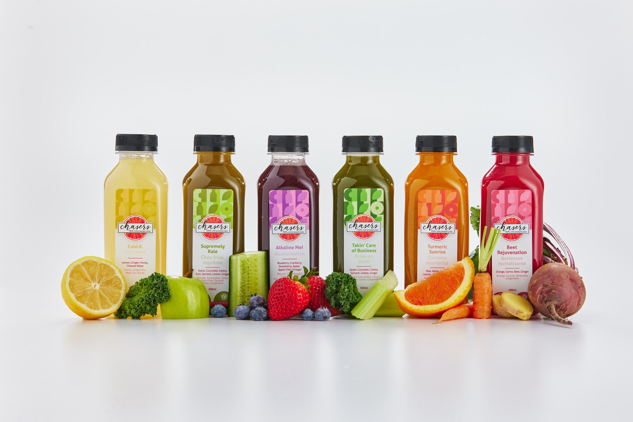
Chasers Juice Packaging Refresh
Chasers Fresh Juice Vancouver stands proudly as a locally owned and operated family business deeply rooted in the heart of British Columbia. Guided by shared values and a steadfast commitment to excellence, the Chaser family is dedicated to crafting "Quality Cold Pressed Juice" without compromise.
At Chasers Fresh Juice Vancouver, family values and unwavering dedication converge to deliver a product that's as genuine and wholesome as the people behind it.
Packaging design
After discussions with the Chasers team we decided to prioritize simplicity, functionality, and a focus on essential elements while maintaining visual appeal. Clean packaging design typically refers to a minimalist approach that focuses on simplicity, clarity, and functionality.
After providing some concepts we decided to move forward with the designs you see before you. The design uses ample white space and a straightforward layout that avoids clutter. The typography is clear, easy-to-read with minimal embellishments. Important product information is presented clearly and concisely, without overwhelming the consumer.
Pattern Illustration design
The brand pattern has some subtle meaning behind it as well as helping be an indicator of flavour.
Circle: This is a generic fruit representation. As Chasers uses many fruit and vegetables the best symbolic way to showcase variety is through the circle.
Large C: The C represents the Chasers
Bottle: The bottle graphic symbolises the unique bottle that all Chasers juices are found in.
Leaf: The leaf represents the natural health and purity of the juices.
The minimal colour palette helps define each flavour whilst the pattern helps brand recognition across all the labels, maintaining brand identity through consistent use of logos, patterns, and typography is key. While the pattern should be consistent, it should also be versatile enough to be applied across different mediums and formats. The pattern can be used across all branded design material.
“Hope is so easy to work with, and her quality of the product she delivers is #1! I would highly recommend Hope for any project you may require- as a business owner I feel she is excellent at what she does!”
— Jill, Chaser Juice
Category: Branding, Graphic Design, Icon Design, Package Design, Photography, Juice packaging, Packaging design, Illustration, Vancouver design.
Let’s work together!
Love the work we provided for Chasers? Our expertise goes above and beyond, it also includes Brand Strategy, Brand Naming, Brand Identity, Brand World, Tone-of-Voice, Packaging Design, Printed Communication, and Digital Design.


