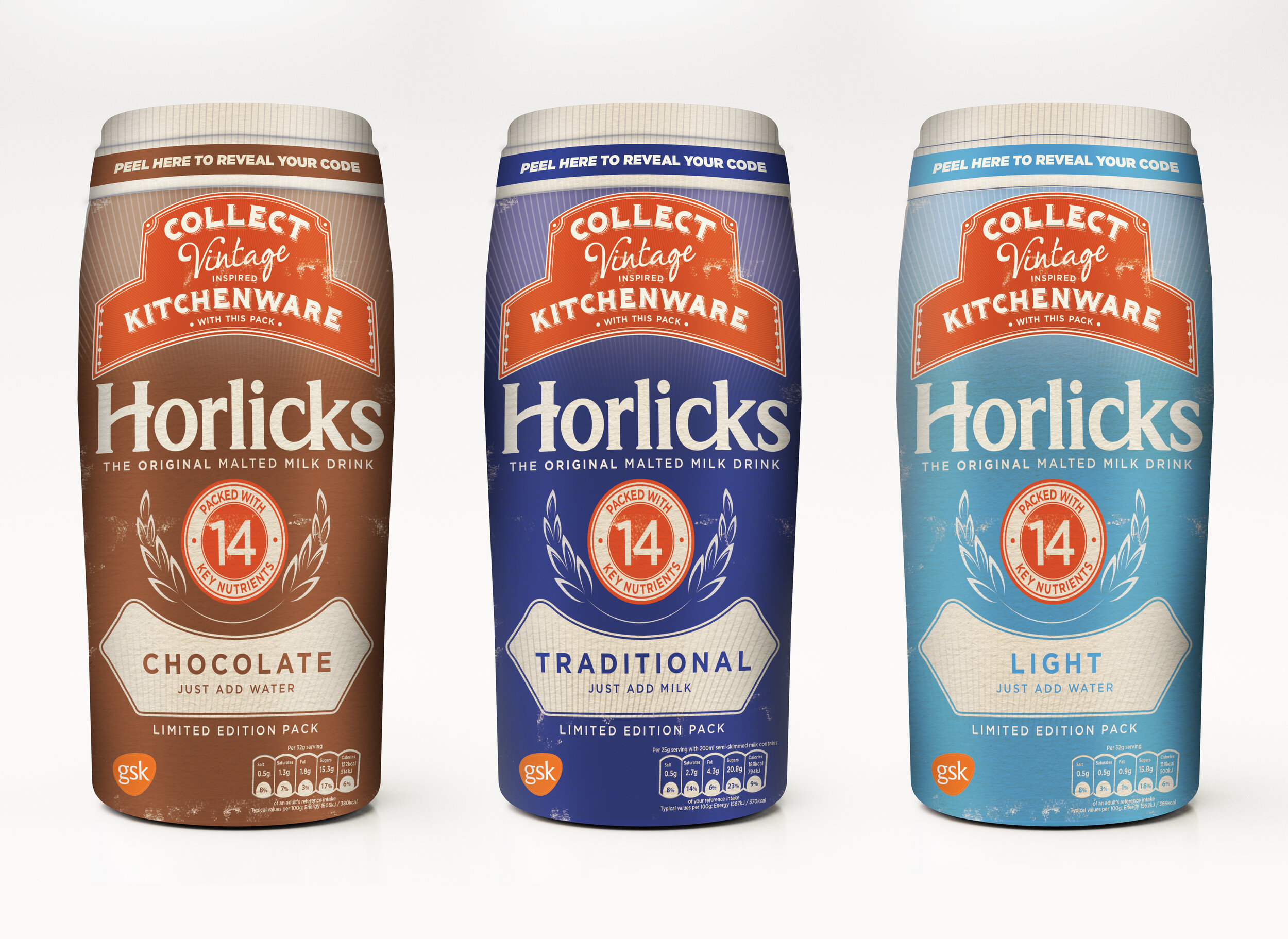
Horlicks has been comforting families for over 140 years. Horlicks has a deliciously, creamy malty taste that is traditionally crafted using malted wheat and barley and enriched with vitamins and minerals.
Horlicks came to ‘designful hope’ with what was an originally a very small project. They had a promotion they wanted to run, whereby consumers had to collect a certain amount of packs to win vintage-inspired kitchenware.
‘designful hope’ was tasked to create just a top section of the promotion and the rest of the pack was to remain in its classic Horlicks look and feel. However, we decided to take it one stage further by pitching a whole pack takeover in a vintage style, which was taken on board.
Here are the original scamps of the final creation.
Along with the packs, ‘designful hope’ also designed the kitchenware that the consumers could win.
Category: Package Design, Graphic Design, Icon Design, Illustration Design
Let’s work together!
Have you worked with designers that just have not understood your vision? Or designers that just do the minimal? With designfulhope you will always get more than you bargained for (or paid for!). Horlicks was a perfect example of how we pushed a brand to do even better! Do you have a marketing campaign you need help with? Get in touch!


