The New World family began making vegetarian foods in a small bakery in Vancouver over 40 years ago, back when "organic" and "natural" were not the norm. Today, they have evolved into creating nut butters and granolas.
Peanut butter
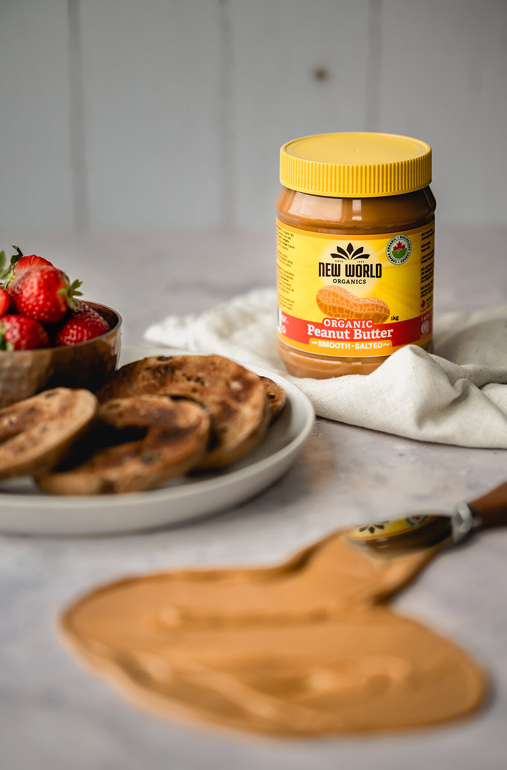
Nothing gets better than the OG of nut butters and that is peanut butter. For ‘designful hope’, this was a very exciting challenge as they already had this whole range out there to purchase. However, within the original design, the distinction between each of the products was difficult for the consumer to recognise straight away. We had to come up with a visual language that separated the organic from the naturals, the crunchy from the smooth, and the salted from the unsalted.



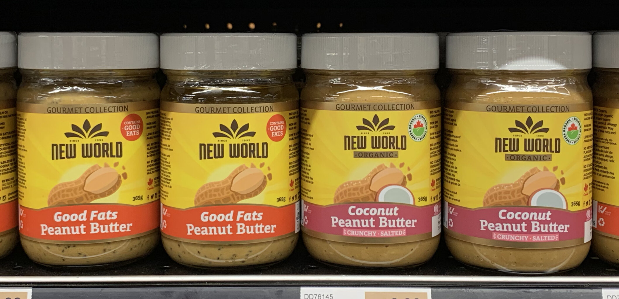
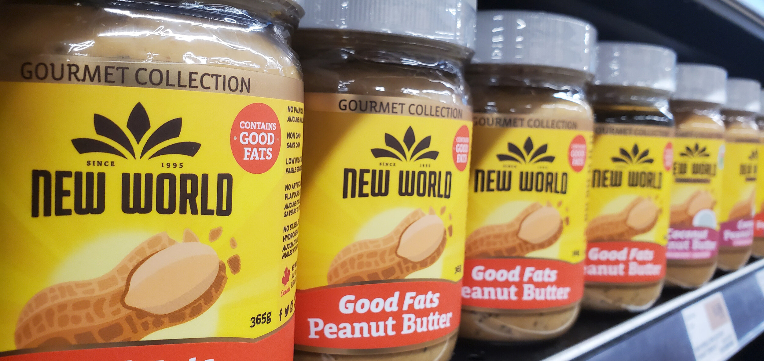
Gourment nut butters
These nut and seed butters all have an extra twist in them to make them part of the gourmet range. To help distinguish them, but still feel part of the New World family, we played around with the structure of the label and added in special printing treatments to make it glow on the shelf.
Granolas
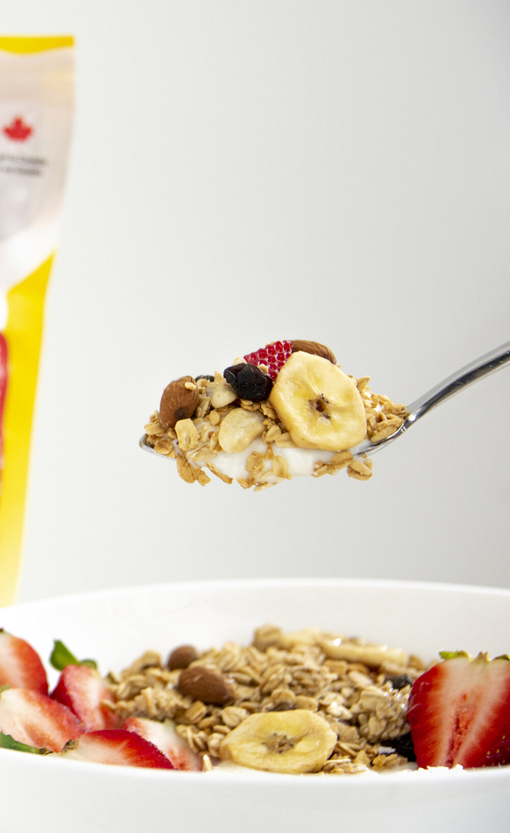
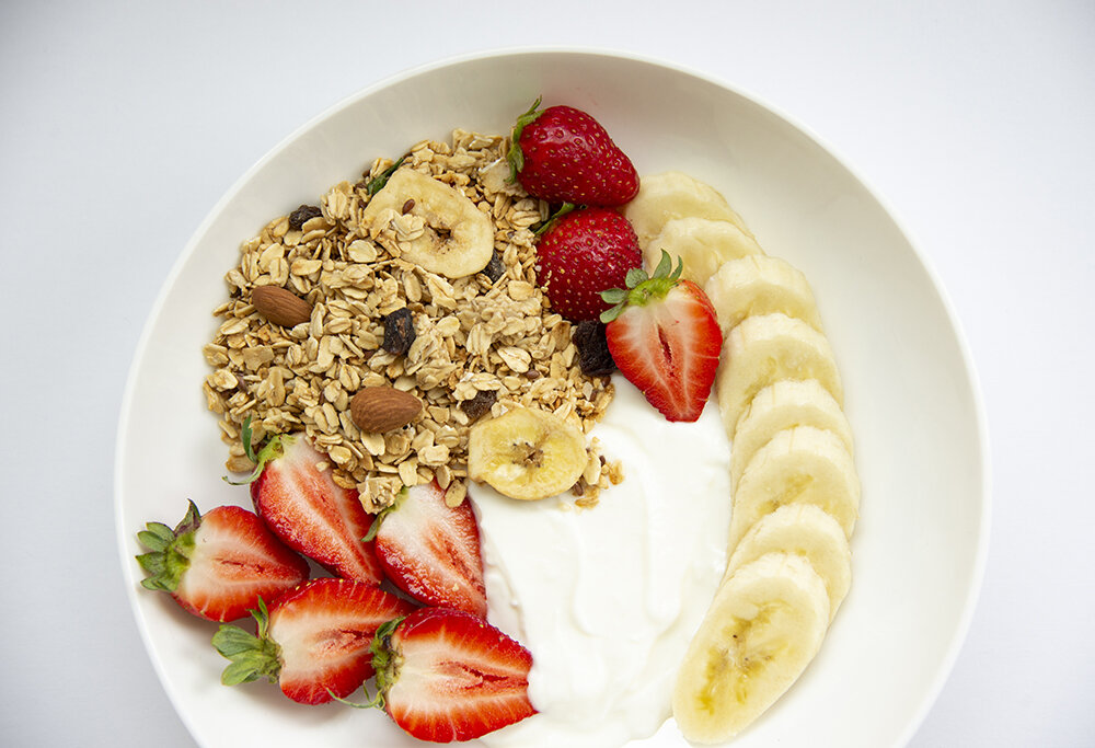
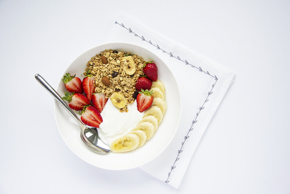
New World granolas wanted to come out with a premium range. This work is still work in progress.
Category: Package Design, Graphic Design, Icon Design, Photography, Social Media Design
Let’s work together!
Newworld Foods was a huge undertaking. They had such a wide range of existing products that needed a redesign. Do you have multiple products you have been meaning to give a little design refresh? We would love to chat with you to work out a clear system for your consumers to navigate. Change is always daunting but Newworld Food is a perfect example of a rebrand done right!


